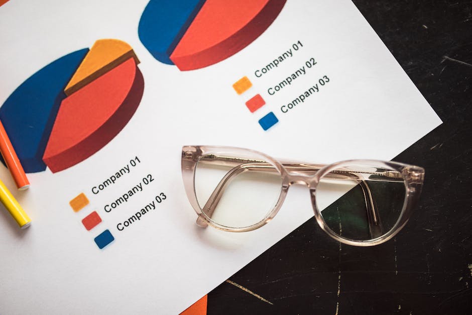
Ready to make your data pop with a comparison infographic? Perfect! Infographics can be the secret ingredient that makes your message tasty and digestible. They’re like a delicious visual sandwich filled with data, creativity, and style.
Whether it’s comparing your favorite sports stars, charting historical events, or reviewing products, a well-made comparison infographic can make the difference between “Meh” and “Wow!”.
Let’s dive into this simple guide and discover how to create eye-catching infographics that speak volumes.
Know Your People and Your Goal
First things first. Who are you creating this infographic for? Knowing your audience is key. It will help you pick the right content and style that will catch their eye.
Also, determine what you want to achieve. Are you showing differences between products, concepts, or time periods? The more focused your aim, the better your infographic will turn out.
Get Your Info and Sort It Out
Before you even think about how your infographic design, get all your facts straight. Make sure they are correct, from trusted sources, and support your goal. Sort your information based on how important and relevant it is.
This step gives you a strong base for a top-notch infographic.
Pick the Best Way to Show Comparisons
Next up is choosing how you want to present your comparisons. This depends on the kind of information you have. For example, if you’re comparing different features of one product, a side-by-side infographic layout would be ideal.
If you’re showing changes over time, a timeline would be better. The trick is to let your information guide your format choice.
Bring Your Infographic to Life
Now comes the fun part – adding some color and style to your infographic. The colors, fonts, and images you choose can make your infographic stand out.
Remember to keep things balanced and harmonious. This is where you can explore how-to-make-infographics to enhance your brand. A consistent color scheme and style can help people easily recognize your brand.
Some easy-to-use tools can help you create a professional-looking infographic, even if you’re not a designer. They offer ready-to-use templates and design options that make the whole process smoother.
Keep It Simple and Visual
The whole point of an infographic is to turn complicated info into simple visuals. Use charts, graphs, icons, and pictures to show your data. Try to keep text to a minimum and let your visuals do the talking.
Double-Check and Tweak
Once you’re done designing your infographic, it’s time to go over everything and make it even better. Look for any errors or areas you could improve. Show your infographic to a few people from your target audience and see what they think. Their feedback can help you fine-tune your infographic before you share it with everyone.
Crafting a Standout Comparison Infographic
That’s a wrap! With these steps, you’re set to create infographics that turn heads. Remember, it’s all about knowing your audience, organizing your info, picking the right layout, adding some creative flair, and keeping it simple. And don’t forget to double-check everything!
Ready to give it a go? Your next standout comparison infographic is a few clicks away. So, roll up your sleeves, ignite your creativity, and start crafting your stunning story today! Enjoy the journey and happy creating!
For more on this topic, visit the rest of our blog!


