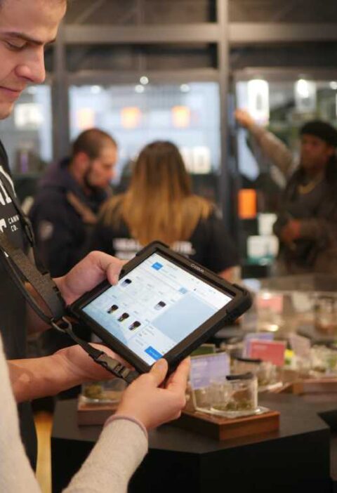
Creating a seamless and effective cart and bag page is a critical factor in maximizing e-commerce sales. Careful design decisions improve user experience and guide shoppers efficiently toward completing their purchases. By reducing friction points and increasing transparency, businesses can retain more users through checkout. For inspiration and the latest trends in website cart design, reviewing industry leaders’ examples can be invaluable in crafting your own e-commerce platform’s checkout flow.
Shoppers often abandon carts due to poor usability and unclear next steps. Well-designed cart pages not only display order details clearly but also foster trust with users, increasing the likelihood of conversion. This means prioritizing visible pricing, intuitive navigation, and reassurance at each stage. Adopting best practices for the cart and bag experience can transform window shoppers into loyal customers, driving long-term growth for e-commerce brands.
A thoughtful cart flow minimizes opportunities for confusion. Encouragingly, small improvements, such as optimizing for mobile devices or enabling guest checkout, can yield significant gains in both satisfaction and sales. Addressing the full flow from visual clarity to security assurance results in a polished experience for every user segment.
As consumer expectations rise, keeping pace with standard-setting sites and platforms is essential. Retailers who apply UX best practices can expect greater checkout retention and higher overall satisfaction. Drawing best practices from leading e-commerce case studies offers practical insight for every business level.
Simple and Clean Layout
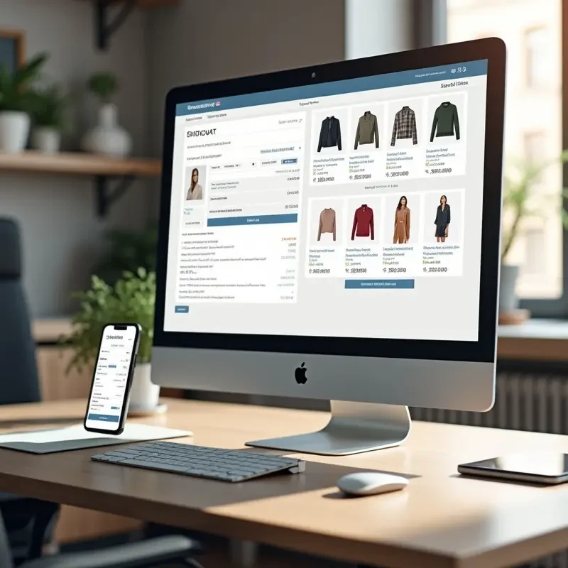
Clarity is the foundation of great cart page design. A clean layout ensures that product names, images, prices, and quantities are easily identifiable. Overly cluttered pages or hidden costs can introduce uncertainty, leading users to hesitate or abandon their carts. As e-commerce continues evolving, clear design remains a key factor in delivering a frictionless shopping experience.
Other layout enhancements might include keeping information consistent across steps or reinforcing the purchase with visual cues, such as thumbnails and confirmation messages. Many leading retailers also leverage whitespace to avoid overwhelming customers, which helps users process information quickly and focus on purchase-critical elements.
Thoughtfully chosen typography and iconography further enhance legibility and professionalism on the cart page. Consistent use of color and generous spacing ensures effortless scanning, while avoiding unnecessary pop-ups or interruptions keeps users engaged with their current intent.
Transparent Pricing Information
Many consumers cite unexpected costs as the main reason for abandoning their carts. Clearly displaying the complete breakdown of item prices, taxes, shipping fees, and any available discounts removes ambiguity. Research suggests that transparent pricing boosts trust and prompts users to proceed confidently through the checkout process.
For even greater assurance, some websites use expandable or collapsible sections that reveal tax and shipping details early in the funnel. This kind of transparency, presented in a non-intrusive manner, minimizes last-minute surprises. Including price-matching guarantees or clear discount explanations helps reassure customers that they are receiving the best available value, which further motivates them to complete the transaction.
Prominent Call-to-Action Buttons
A prominent “Proceed to Checkout” button, differentiated through color and strategic placement, guides shoppers on what to do next. CTAs should be visible immediately and avoid unnecessary distractions around them. Reducing visual noise near action buttons helps streamline the path to conversion, ensuring shoppers never wonder about their next step.
Strategically repeating call-to-action buttons at the top and bottom of the cart page is a common best practice. This approach eliminates unnecessary scrolling and friction, especially on longer cart pages with multiple items. Supplementing action buttons with microcopy, such as “Safe and Secure Checkout” or “No Payment Required Yet,” can further reduce anxiety and gently nudge users forward without making them feel pressured.
Mobile Optimization
Today, a large percentage of users shop from mobile devices. Responsive cart page designs that adapt seamlessly to various screen sizes are paramount. Mobile-optimized layouts employ streamlined navigation, touch-friendly buttons, and easily toggled menus. Enhanced mobile usability dramatically lowers the risk of abandonment from mobile shoppers who expect a swift, intuitive experience.
An additional mobile-optimization strategy is implementing auto-fill for shipping and billing fields, reducing manual entry. Device-specific payment options like Apple Pay or Google Pay can also expedite the process. Fast-loading graphics and visible progress indicators are especially valuable for mobile users who may be shopping on the go and have less patience for delays or complicated forms. Ensuring robust error handling and user-friendly prompts helps maintain momentum at every touchpoint.
Guest Checkout Option
Users often balk at the need to create accounts before finalizing purchases. Offering a guest checkout option accommodates customers who prioritize a fast, hassle-free transaction over creating an account. This flexibility significantly increases conversion rates by serving shoppers who value convenience over loyalty programs or order tracking.
Retailers can encourage repeat business by providing the option to create an account after purchase, rather than before. A non-intrusive invitation, such as “Save your details for next time?”, placed after confirmation allows retailers to capture interested customers without disrupting the initial checkout flow. When guest checkout is combined with clear communication about privacy and simplicity, it resonates with both first-time buyers and those wary of sharing too much personal data.
Editable Cart Items
Empowering shoppers to adjust quantities or remove items without leaving the cart page reduces frustration. Easy-to-use controls, such as quantity selectors or remove buttons, enhance autonomy and reduce errors caused by backtracking. Immediate feedback and updates upon modification keep users informed about their changing order totals.
Many top cart designs feature inline editing, where changes update totals in real time and provide instant visual feedback, such as a spinner or a highlight effect. Additional information, such as inventory alerts (e.g., only a few items left), can convey gentle urgency without seeming overly pushy. By providing shopper-friendly editing features, businesses demonstrate attentiveness to customer needs, boosting satisfaction and reducing abandonment rates.
Progress Indicators
Visual progress indicators are subtle, effective cues that build confidence by showing shoppers exactly where they stand in the checkout process. A simple bar or step-by-step marker reassures users, eliminating uncertainty and decreasing the likelihood of cart abandonment due to confusion. These cues set clear expectations, making the journey to checkout feel manageable and transparent.
Checkpoint milestones, such as Cart, Shipping, Payment, and Review, make the process visible and easy to follow. Offering users the ability to go back and forth between steps without losing information also reduces anxiety, helping users feel in control from start to finish. Integrating smart design elements, like dynamic progress updates and encouraging microcopy at each stage, further smooths the path to conversion.
Security Assurance
Displaying icons for secure payment methods, SSL certificates, or other trusted badges is an essential confidence booster. Security assurance visuals help alleviate concerns over personal data or credit card safety, particularly among first-time shoppers. Explicit statements about encryption and compliance standards further reinforce trust, ensuring users feel protected when submitting sensitive information.
Trust can be built by positioning these security elements close to, or within, the payment form itself. Displaying links to privacy policies or short security FAQs further reassures the customer. Adding logos from payment providers, security partners, and recognized industry certifications (such as PCI compliance) helps demonstrate legitimacy. For international shoppers, language localization of security info can foster an even stronger sense of safety and belonging. Ultimately, users should feel at ease as they move closer to sharing their payment details.
Consistently applying these best practices results in a smoother cart experience. Investing in UX improvements from layout to checkout options pays off in the form of higher conversion rates, fewer abandoned carts, and improved customer retention. By continually iterating on proven strategies, e-commerce platforms set themselves up for long-term success in an increasingly competitive landscape.